Data Visualization
Data visualization is the graphical representation of information and data using visual elements such as charts, graphs, and maps to help people understand patterns, trends, and insights.

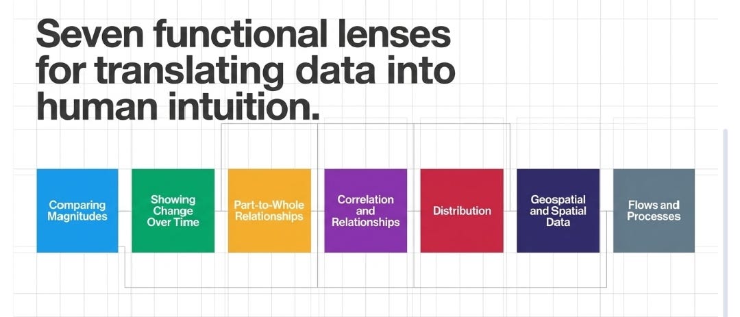
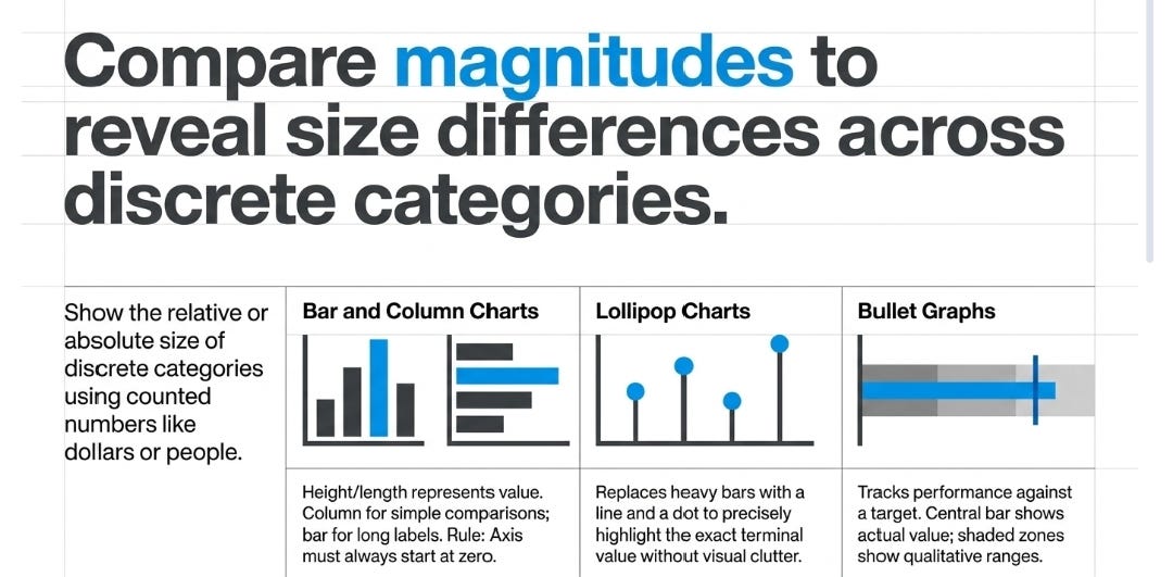
Comparing Magnitudes (Size Comparison)
These charts are used to show the relative or absolute size of discrete categories using “counted” numbers like dollars or people.
Bar and Column Charts: These use rectangular bars where the height (column) or length (bar) corresponds to a numerical value. Column charts are vertical and best for simple comparisons, while Bar charts are horizontal and ideal when category labels are long. Important: The axis must always start at zero to avoid misleading the reader.
Lollipop Charts: A variation of a bar chart where the bar is replaced by a line ending in a dot (the “lollipop”). These are visually appealing and draw more attention to the specific data value rather than the bulk of the bar.
Bullet Graphs: A space efficient variation of a bar chart designed to track performance against a target. They typically feature a central bar for the actual value and a background shaded area representing qualitative ranges (e.g., poor, good, excellent).

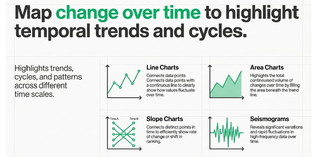
Showing Change Over Time (Temporal Trends)
These visualizations highlight trends, cycles, and patterns across different time scales.
Line Charts: These connect individual data points with a continuous line to show how values change over time. They are the standard for highlighting overall trends, such as stock prices or temperature changes.
Area Charts: Similar to line charts but with the space below the line filled in. They are used to show how a total changes over time, though it can be difficult to see changes in individual components.
Slope Charts: These connect data points between two or three points in time. They are effective for showing the rate of change or rank change between specific dates.
Seismograms: A specialized visualization for showing significant variations and fluctuations in data over time, resembling a heartbeat monitor.
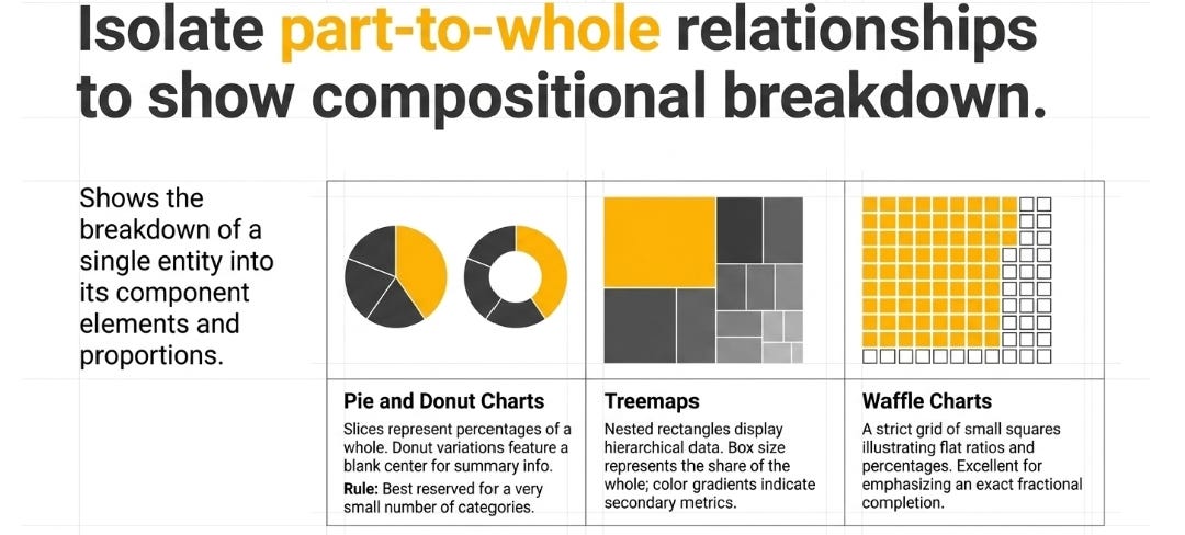
Part-to-Whole Relationships (Proportions)
These charts visualize the breakdown of a single entity into its component elements.
Pie and Donut Charts: Circular charts divided into slices representing percentages of a whole. Donut charts have a blank center that can be used to display additional information like the total sum. They are best for a small number of categories.
Treemaps: These use nested rectangles to display hierarchical data and proportions in a compact space. The size of each rectangle represents its share of the whole, and color can be used to show growth or decline.
Waffle Charts: A grid of small squares (usually 100) where each square represents a fixed portion of the whole. They are excellent for illustrating ratios and percentages in an intuitive, easy-to-read way.

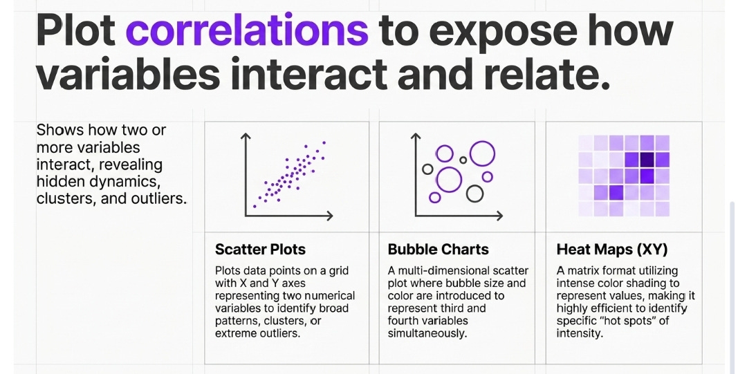
Correlation and Relationships
These show how two or more variables interact or relate to each other.
Scatter Plots: These plot individual data points as dots on a grid with X and Y axes representing two different numerical variables. They are ideal for identifying patterns, clusters, or outliers.
Bubble Charts: A multi-dimensional version of a scatter plot where the size and color of the dots represent third and fourth variables.
Heat Maps (XY): A matrix format using color shading to represent values, making it easy to identify “hot spots” or patterns of intensity in large datasets.
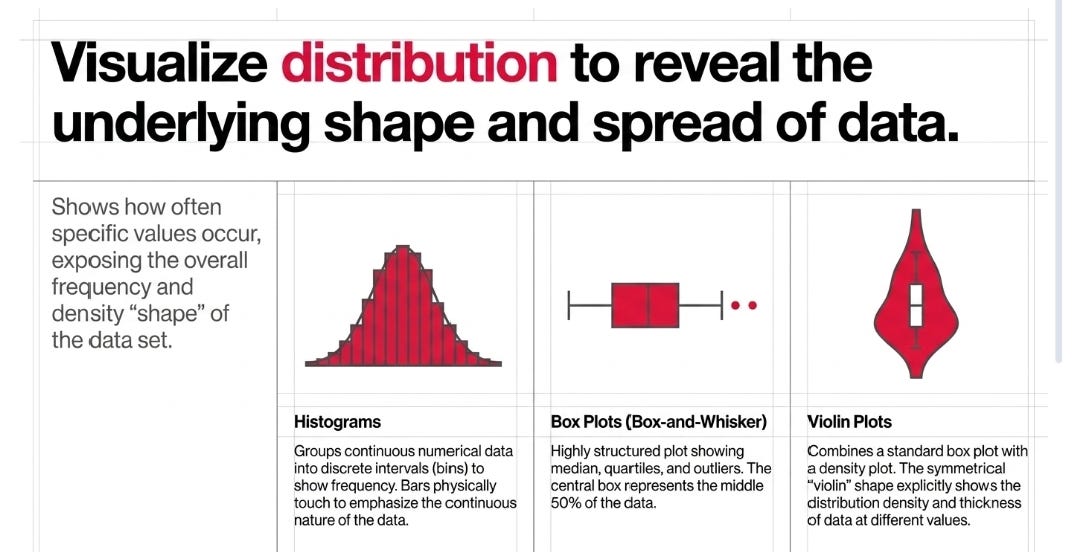
Distribution
These charts show how often values occur and reveal the shape and spread of the data.
Histograms: Similar to bar charts, these group numerical data into intervals (bins) to show frequency. The bars touch each other to emphasize the continuous nature of the data distribution.
Box Plots (Box-and-Whisker): These summarize a distribution by showing the median, quartiles, and outliers. A “box” represents the middle 50% of the data, with “whiskers” extending to the minimum and maximum values.
Violin Plots: These combine a box plot with a density plot, creating a shape that resembles a violin to show the detailed distribution and “thickness” of data at different values.
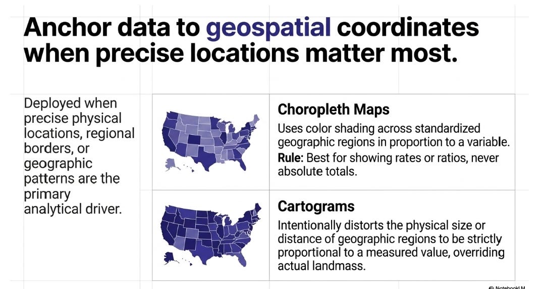
Geospatial and Spatial Data
Used when precise locations or geographic patterns are the most important factor.
Choropleth Maps: These use color shading across geographic regions (like states or countries) in proportion to a variable. They are best for representing rates or ratios rather than absolute totals.
Cartograms: These distort the size or distance of geographic regions to be proportional to a measured value (e.g., inflating the size of a state with a larger population).
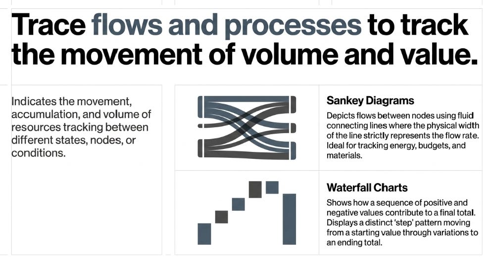
Flows and Processes
These indicate the movement and volume of resources between different states or conditions.
Sankey Diagrams: These depict flows between nodes using connecting lines where the width of the path represents the flow rate. They are useful for tracking things like energy movement or budget transfers.
Waterfall Charts: These show how a series of positive and negative values contribute to a final total. They typically feature a “step” pattern that shows how a starting value moves toward a year-end total.